So in the last post, we made a search engine for the NDK3.2 documentation
NDK - New Documentation Search Engine.
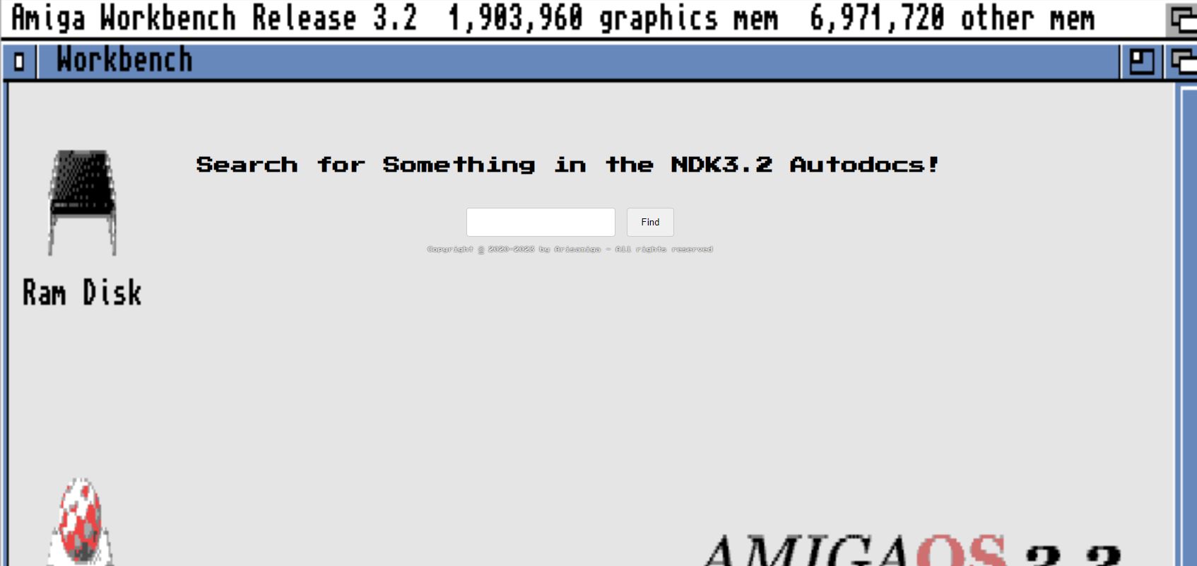
I have made some improvements to the search engine and I will show you what I have done and the reason why I have each change.
I replaced the way of storing the data from an Array to a Map
So in the last post, I used an array to store the data. But I have found out that it is better to use a map instead of an array. So I have replaced the array with a map.
var Autodocs = new Map();

Autodocs.forEach(element => {
    fetch("./Autodocs/" + element)
    .then(response => response.text())
    .then(data => {
        Autodocs.set(element, data);
    });
});

function search() {
    var search = document.getElementById("search").value;
    var results = document.getElementById("results");
    results.innerHTML = "";
    Autodocs.forEach((value, key) => {
        if (value.includes(search)) {
            var text = value.replace(search, "<mark>" + search + "</mark>");
            results.innerHTML += "<p>" + text + "</p>";
        }
    });
}
That way we will not have any complications with having to use the index of the array to get the name of the file which can result in getting the wrong file.
By using a map we can use the name of the file as the key and the content of the file as the value so the name will be associated with its content.
Used REM instead of percentages for the font size
What is REM?
REM (short for “root-em”) units dictate an element’s font size relative to the size of the root element. By default, most browsers use a font size value of 16px. So, if the root element is 16px, an element with the value 1rem will also equal 16px.
That is good because it means that the font size will be the same on all devices. So if you have a 16px font size on your computer and you have a 16px font size on your phone, it will look the same on both devices.
Used VW instead of percentages for the width of elements
What is VW?
Viewport Width or vw. This unit is based on the width of the viewport. A value of 1vw is equal to 1% of the viewport width.
You can also use the vh unit, which is based on the height of the viewport. A value of 1vh is equal to 1% of the viewport height.
What is Viewport?
The viewport is the area of a web page that’s visible to the user.
The viewport is fundamental to web development since its dimensions are what control how page elements appear.
The viewport is like a rectangle, the size of which is determined by the size of the user’s device. On a desktop device, the viewport size matches the browser’s window size, excluding the toolbar and other elements that aren’t part of the page. On a mobile device, the viewport is generally the size of the device’s screen.
Added a word selector for each file
So I added a way to move to the next word in the file. So if you want to move to the next word you can press the right arrow key and if you want to move to the previous word you can press the left arrow key it will also display how many of a certain word there is in the file and on which word you are currently at.
That way it’s easier to navigate through the file.
To focus on the next word you can use the .scrollIntoView() method. This method scrolls the document to make the specified element visible.
    var mark = document.getElementsByTagName("mark")[0];
    mark.scrollIntoView();
Also, you can use .scrollIntoView({block: "center"}) to make the element visible in the center of the window instead of the top.
    var mark = document.getElementsByTagName("mark")[0];
    mark.scrollIntoView({block: "center"});
Added a way to move to the top of the page.
So I added a way to move to the top of the page. So if you want to move to the top of the page you can press the up arrow key which is better than having to scroll to the top and it will make it easier to navigate through the files.
Hope you enjoy the new updates and features to the search engine and Thanks for reading :D